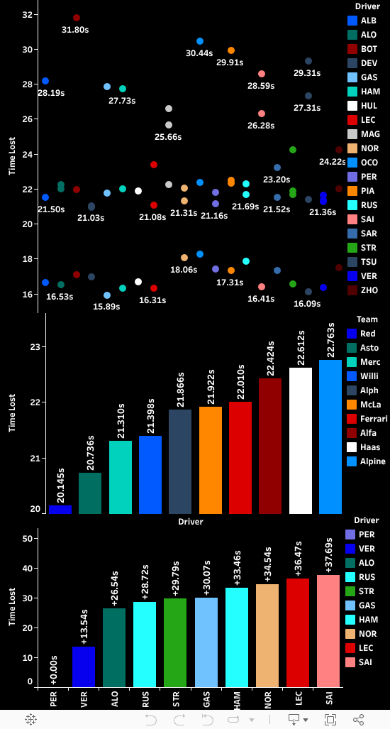
The First Analysis show us the Driver Race Pace for all the laps when the flag was Green(i.e Track Status was 1). The filter below it provides us the legend for drivers.
Here we plotted Drivers on the x-axis and Lap Time in Seconds on the y-axis. And then we made a box plot with the median of all Lap Times and Sorted it according to the Median.We can see that Verstappen had the fastest Pace foloowed by Perez, then Albon. And the worst race pace is shown by Alonso and Russell.
The second and third Analysis show us the Air and Track Temp. throughout the session both gradually increased meaning less grip and tougher conditions to drive as the session went on.
The Fourth Analysis show us the Team Race Pace for all the laps when the flag was Green(i.e Track Status was 1). The filter below it provides us the legend for Teams.
Here we plotted Teams on the x-axis and Lap Time in Seconds on the y-axis. And then we made a box plot with the median of all Lap Times and Sorted it according to the Median.Red Bull Racing had the fastest race pace followed by Alfa Romeo. And the worst Race pace is shown by Mercedes and Mclaren.
The Fifth Analysis is Delta Time Analysis for the fastest laps of Hamilton, Sainz, Leclerc, Verstappen and Perez. Verstappen had the fastest time out of all hence he is taken as the 0 line value and all the others lines are the gap at that specific distance from Verstappen's time. The Lines are colored according to Driver their legend is below the anlysis only.
In the Center we Have the results of Qualifying Sorted according to the positions with driver times, driver numbers and broadcast names.
We also plotted the humidity and pressure throughout the session. As humidity increased meaning there was less tyre grip and pressure was constant throughout so nothing much changed due to it.
Also we showed the how track temperature and air temperature changed over time both decreased gradually meaning improved conditions and tyre grip as time went on.
We also plotted the cumlative delta Time of the Top 5 finishers fastest laps all over qualifying with respect to Ver and saw where did the others lost time.
In the Center we Have the results of Qualifying Sorted according to the positions with driver times, driver numbers and broadcast names.
We plotted the average race speed of all drivers through the longest straight.
Also we showed the how track temperature and air temperature changed over time both got hotter meaning drivers would have been struggling as the time went on to find grip and as conditions worsen.
We also plotted the cumlative delta Time of the Top 5 finishers fastest laps all over qualifying with respect to Ver and saw where did the others lost time.
The First two analysis show us the how the track Temp and Air Temp Changed throughout the whole race.
The Air Temp was mostly constant throughout.Track Temp decreasing gradually this means that as time went on the tyre grip was getting better.
The Third Analysis show us the tyre strategies of all Drivers for the whole race. It shows us what strategies did the drivers thought to do. Did anyone make an undercut or an overcut pitstop. What all strategies are used and much more.
Here we plotted Drivers on the x-axis and Lap Number on the y-axis. And then we made a circlular discrete plot with colors as Compound so that when the compound is changed the color of circle is also changed.We can see that mostly all the drivers opted for first the inters as it was raining and then the medium or soft compound of tyre as the track dried down in the later parts of race.
The Fourth Analysis show us the position of all Drivers throughout the whole sprint race.
The First analysis show us the time taken by drivers in pits.
The Second analysis shows us the time taken by teams in Pits Mercedes took the least time in Pits while Williams took the most.
The Third Analysis show us the Time Lost By the Top point Finishing Drivers in the Pits.
The First Analysis show us the fastest Lap Times Per Driver.
Here we plotted Drivers on the x-axis and Time in Seconds on the y-axis. And then we made the bar graph of all the fastest laps of each driver and colored it by Driver.We can see that Hulkenberg had the fastest lap of the race.
The Second Analysis show us the Best Possible Time Per Compound Possible.
Here we plotted Compounds on the x-axis and Time in Seconds on the y-axis. And then we took the minimum time per compound for each sector and added them to get the best possible time on that compound.We can see that the Medium Compound shows the Best possible time followed by Soft Tyres and then Intermediate Tyres.
The Third Analysis is the Best Possible Time that a driver could have gotten if he had all the minimum time's for each sector.
The First Analysis show us the Driver Race Pace for all the laps when the flag was Green(i.e Track Status was 1). The filter below it provides us the legend for drivers.
Here we plotted Drivers on the x-axis and Lap Time in Seconds on the y-axis. And then we made a box plot with the median of all Lap Times and Sorted it according to the Median.We can see that Verstappen had the fastest race pace followed by Perez. The worst race pace is shown by Hulkenberg and Sargeant.
The Second Analysis is showing us how the position's changed as the race went on. And also it has a line where the Position Value goes to 0 (it is used to represent that the driver has retired due to any problem or crash).
The Third Analysis show us the Team Race Pace for all the laps when the flag was Green(i.e Track Status was 1). The filter below it provides us the legend for Teams.
Here we plotted Teams on the x-axis and Lap Time in Seconds on the y-axis. And then we made a box plot with the median of all Lap Times and Sorted it according to the Median.Red Bull Racing The winners of last year constructors championship had the Fastest Race Pace, then it was followed by the Ferarri. The worst Race Pace was shown by Williams and Hass.
The Fourth Analysis Shows the Cumualtive Delta Plot of top 5 finishers per lap in comparison to the winner(VER).
The First two analysis show us the how the track Temp and Air Temp Changed throughout the whole race.
The Air Temp first increased gradually meaning difficult conditions to drive as time went on.Track Temp increased first then decreased hence grip was changing throughout and drivers had to keep making adjustments.
The Third Analysis show us the tyre strategies of all Drivers for the whole race. It shows us what strategies did the drivers thought to do. Did anyone make an undercut or an overcut pitstop. What all strategies are used and much more.
Here we plotted Drivers on the x-axis and Lap Number on the y-axis. And then we made a circlular discrete plot with colors as Compound so that when the compound is changed the color of circle is also changed.We can see that mostly all the drivers opted for first the medium compound and then the hard compound of tyre as their strategy.
The First Analysis show us the fastest Lap Times Per Driver.
Here we plotted Drivers on the x-axis and Time in Seconds on the y-axis. And then we made the bar graph of all the fastest laps of each driver and colored it by Driver.We can see that Verstappen had the fastest lap of the race.
The Second Analysis show us the Best Possible Time Per Compound Possible.
Here we plotted Compounds on the x-axis and Time in Seconds on the y-axis. And then we took the minimum time per compound for each sector and added them to get the best possible time on that compound.We can see that the Soft Compound shows the Best possible time followed by Hard Tyres and then Medium Tyres.
The First analysis show us the time taken by drivers in pits.
The Second analysis shows us the time taken by teams in Pits Red Bull took the least time in Pits while Williams took the most.
The Third Analysis show us the Time Lost By the Top point Finishing Drivers in the Pits related to Perez as he had the best average in pits out of all the point finishers.
The First analysis Shows all the results with driver broadcast name, Start Position, Final Position and the points they earned for the race.
The Second Analysis show us the number of positions gained or lose from the start and at the end of the race by the drivers. Piastri gained the most positions out of all he gained 8 positions.